
What makes an interface recognizably Irozon.
An Irozon surface reads as Irozon before a viewer ever registers the logo: White and Ink carry the layout, Green appears once with intent rather than everywhere at low intensity, type is confident and geometric, whitespace is generous rather than apologetic, and motion responds to input instead of decorating the page. Every section below — logo, color, imagery, icons, voice, personality — is one expression of that same restraint. None of it is specific to any one product, page or codebase; it applies equally to a marketing site, a client dashboard, or an internal tool.
Official assets only — never recreated.
logo/ is the master reference folder for every official logo asset
and is the single source of truth for this section. The variants below are the actual
files found there — nothing here is redrawn, recolored, cropped or approximated.






Also present in logo/: a wordmark-only mark with no symbol (irozon-text.png
plus dark/light variants) and the source Illustrator file
(irozon-branding.ai). Not tiled above to keep this section a reference, not
a gallery of near-duplicates.
Correct vs. incorrect use
Use the supplied file as-is: original proportions, original colors, clear space around it.
Never stretch/distort the aspect ratio, and never apply arbitrary colors, shadows, outlines or bevels — shown here only to illustrate the mistake.
Logo rules
- Never recreate the Irozon wordmark by typing "irozon" in Manrope, Chalet, or any other font — the wordmark is artwork, not type.
- Never stretch or distort the logo, and never change its aspect ratio.
- Never apply arbitrary colors, or add shadows, outlines, glow or bevel effects.
- Never modify the internal spacing between the symbol and the wordmark.
- Prefer the official supplied variants over recoloring the SVG/CSS at runtime.
Clear space
Maintain clear space around the logo approximately equal to the height of the symbol's inner ring/mark. This is the current digital usage rule for this design system, not a historical specification — the supplied assets don't include formal clear-space measurements from the original brand guidelines.
Minimum size
Full lockup: don't render narrower than roughly 100–120px wide on screen. Symbol only: don't render smaller than roughly 24×24px — below that the inner ring of the mark stops reading clearly. This is current digital guidance based on the supplied assets' legibility, not a historical spec.
Logo on dark
Reversed/white treatment (logo/irozon-icon-light.png or
irozon-logo-full-light.png) on any Ink-derived dark surface — verified
~15:1 contrast, see Accessibility.
The regular dark/Ink mark (or the gradient mark at low contrast) on an Ink-derived surface — it disappears instead of reading as the logo. Always switch to the reversed/white variant once the background gets dark.
The gradient lockup may still appear on a dark surface only if the surrounding area is light enough (photography, a light card floating on a dark section) to keep its own contrast — never directly on Canvas, Surface or Elevated dark tokens.
White, Ink and Green carry the system. Lime is a rare accent.
These four brand primitives are constant in every theme and every product. See Color for the full palette, semantic tokens and usage rules.
White and Ink carry the layout in either theme; Green is the single confident accent, used once with intent rather than spread thin; Lime stays rare — a gradient stop or a small highlight, never a general-purpose fill.
Real Irozon work first, presented plainly.
Examples below are actual project covers, shown at a single consistent aspect ratio.
Visual direction
Irozon imagery is authentic, refined and premium — human and technically credible rather than staged. It favors restraint over spectacle: real project work over generic SaaS stock photography, and a deliberate crop or context over unnecessary artificial effects (gloss, bevels, floating-device props, decorative 3D renders). Product imagery should feel intentional and contextual — chosen because it shows something specific, not because a slot needed filling.
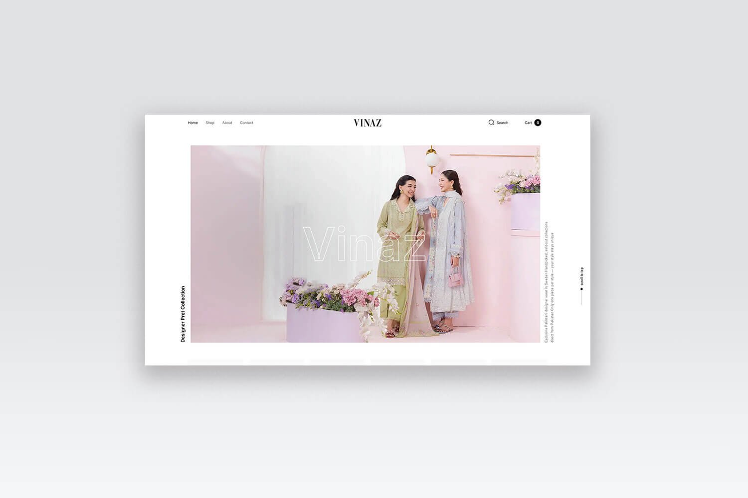
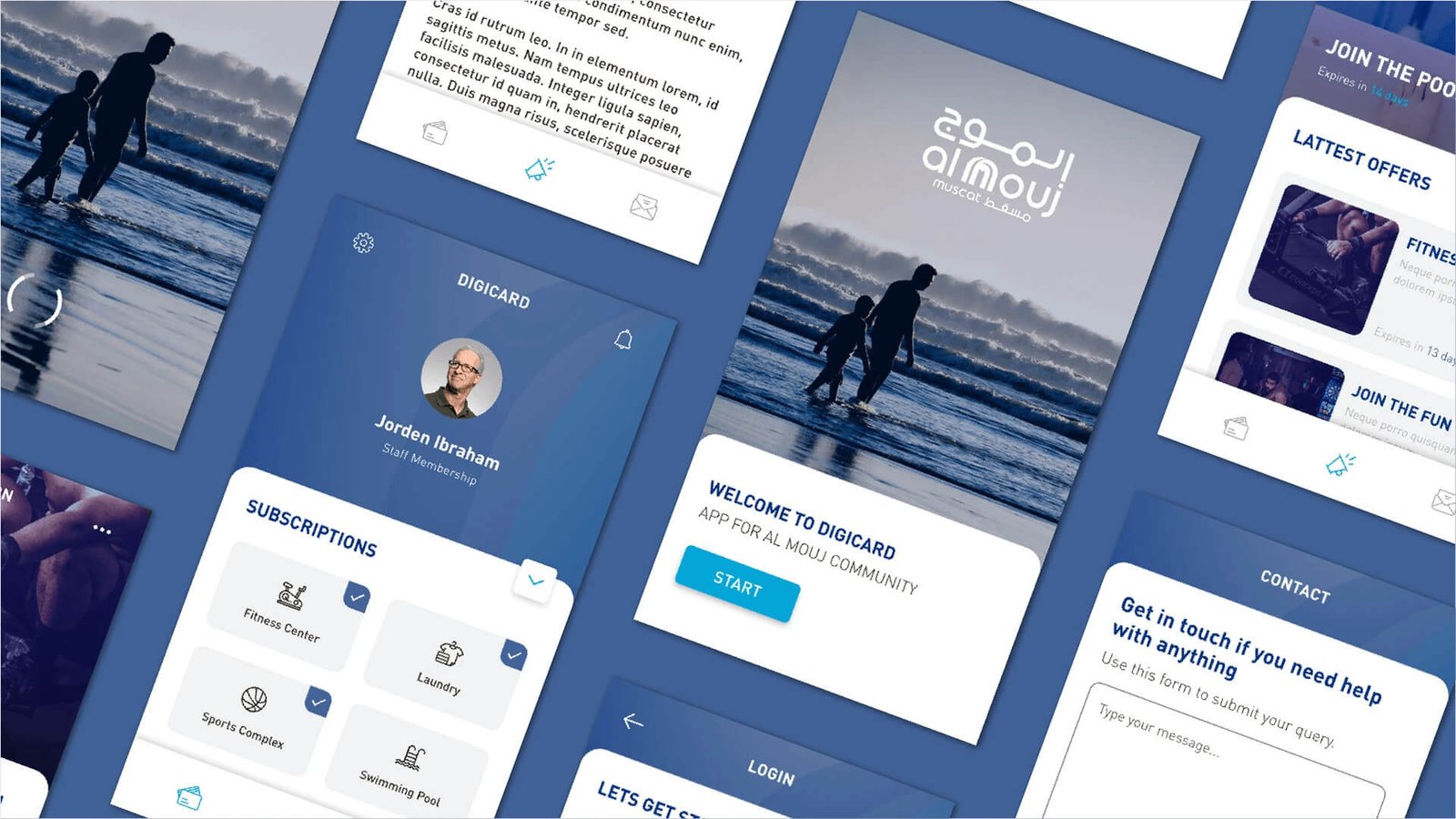
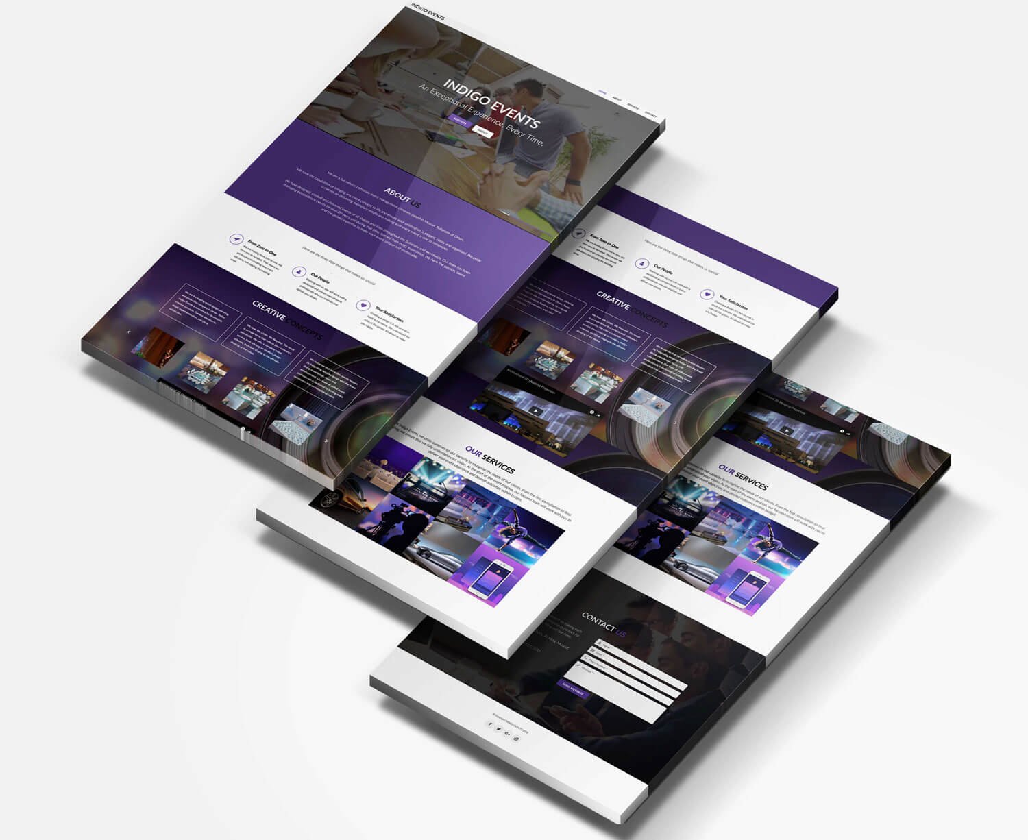

- Real Irozon client/project work always comes first — prefer it over generic stock mockups or decorative 3D renders whenever a real asset exists.
- Frame devices/products consistently — same angle, same crop logic, across a set.
- Keep backgrounds clean and neutral; let the work be the subject, not a staged scene.
- Use large imagery rather than small thumbnails wherever layout allows.
- Hold one aspect ratio per grid — mixed ratios read as unfinished.
- Avoid decorative clutter: no unnecessary badges, stickers, glossy 3D device props or drop-shadow stacks on top of real screenshots.
Aspect ratios
Four ratios cover every current use. Hold one ratio per grid — mixed ratios read as unfinished — and crop a one-off image to the nearest ratio rather than introducing a fifth.
- Grid/tile imagery — fixed
1:1square. Every card in one grid holds this ratio. - Featured/hero visual —
16:9widescreen by default. - Supporting visual —
4:3by default. -
Portrait detail shot (a phone screen, vertical UI) —
3:4, used sparingly and only when the source material is genuinely portrait.
Alt text
- Meaningful project/case-study imagery gets concise, descriptive alt text — what the image actually shows (e.g. "VINAZ — E-commerce"), never a keyword-stuffed SEO phrase.
-
A placeholder graphic standing in for imagery that doesn't exist yet carries no
altat all when it has a visible caption of its own — there's no real content for the empty alt to duplicate, and the caption already explains itself to a screen reader. - Repeated imagery never reuses one identical alt string across many instances — each tile's alt text names the specific real project it shows, so assistive tech doesn't hear the same phrase over and over.
Lightbox / focused-image overlay
Where gallery or case-study imagery opens into a focused, full-size view, one shared overlay pattern applies rather than a bespoke one per product or per project:
- Backdrop — the canonical Ink-family overlay token at a high-opacity level, sufficient to separate the focused image from the page. Never pure black, and never a decorative gradient.
- Image — centered, natural aspect ratio, never cropped; sized to always stay inside the viewport rather than overflow it.
- Controls — a close control, Previous/Next only when there's more than one image, and a subtle position indicator ("n / total") — no thumbnails, no extra chrome.
- Navigation — Previous/Next, arrow keys, and swipe (where touch applies) all wrap from last back to first and back again. A single-image gallery hides the arrows and counter entirely rather than showing "1 / 1."
- Dismissal — Esc, the close control, or clicking the backdrop; clicking the image itself never closes it.
- Accessibility — the overlay must trap focus, close with Esc, restore focus to the exact control that opened it, and expose correct dialog semantics to assistive technology.
-
Reduced motion — the open/close transition and any per-image
cross-fade drop to instant under
prefers-reduced-motion; no zoom or bounce at any time. See Motion. - Progressive enhancement — the underlying grid/gallery stays real, crawlable markup; the overlay only ever displays content already present in that markup, never something exclusive to it.
Implementation note — the current irozon.se lightbox realizes this as Irozon Ink at 95% opacity for the backdrop, and uses Radix's Dialog primitive for the focus-trap and dialog semantics above. Any accessible dialog/modal primitive that satisfies the canonical rule is an equally valid choice on a different stack.
One icon style, used consistently.
Canonical rule: use one consistent line-icon family throughout a product — simple, stroke-only glyphs at a consistent optical weight, never mixed with a filled set, an emoji-as-icon, or a second stroke family at a different weight. Icons support comprehension; they don't decorate every label.
Canonical icon source:
Tabler Icons via
@tabler/icons-react. The full icon rules, sizing guidance, React
examples and brand-mark exceptions live on the dedicated Icons
foundation page.
Existing brand guidance preview. New product UI should use the Tabler Icons rules on the dedicated Icons page.
Rules
- One icon family per product. Never mix in a filled icon set, an emoji-as-icon, or a second stroke family at a different weight — it reads as inconsistent immediately.
- Use Tabler's normal outline treatment consistently. Don't vary stroke widths between icons for emphasis; use semantic color or a larger size instead.
- Three sizes cover nearly everything — 16px for compact controls, 20px for default UI, and 24px for large or feature icons. Anything else needs a specific component reason.
- Use icons sparingly and with restraint. Icons support text, they don't replace it — pair an icon with a label rather than instead of one, except for universally understood actions (close ×, external-link arrow).
-
Decorative icons get
aria-hidden="true"; icons that are the only content of a control need an accessible label.
Calm, confident, clear — never corporate.
Irozon writes the way the interface looks: reduced, precise, and sure of itself without needing to oversell.
- Calm — no urgency tricks, no exclamation-point energy.
- Confident — states what Irozon does, doesn't hedge with qualifiers.
- Clear — plain language over jargon; a reader shouldn't need to decode it.
- Concise — one idea per sentence; cut the word that isn't earning its place.
- Professional without corporate jargon — no "synergy," "cutting-edge," "leverage," "solutions" as a filler noun.
"Websites built to move your business forward."
Concrete, active, says what it is. A reader knows exactly what they're getting.
"We deliver cutting-edge innovative digital transformation solutions."
Four buzzwords, zero information. Could describe any agency, says nothing about Irozon specifically.
Premium through reduction.
The same restraint that governs color and type governs layout and motion — every one of these ties back to a section already documented above.
- Premium through reduction — strip the unnecessary rather than decorate to compensate. See Color and Typography.
- Generous whitespace — 96–160px section padding on desktop; see the Spacing scale.
- Restrained borders/shadows — 1px borders and the three-tier subtle shadow scale, never a heavy drop shadow for its own sake. See Surfaces.
- One dominant CTA per context — the Signature CTA appears once per page/section; everything else is Secondary or Tertiary. See Buttons.
- Motion only when it communicates something — state change, direct feedback, spatial relationship. Never motion as ambient decoration. See Motion.
A few rules worth seeing, not just reading.
Real project work, framed plainly. Technically credible and specific — it could only be Irozon's work.
Generic SaaS stock imagery and decorative illustration — interchangeable with any other product, and says nothing about Irozon specifically.
One line-icon family, consistent stroke weight and optical size throughout.
A filled icon, a stroke icon and an emoji mixed in the same context — three different visual weights reading as one unfinished set.